

Zeit -A Time Travel Website
An e-commerce travel booking website which allows booking time travel experiences to the past.
Project Time - 3 months
Project Deliverables - Research, User Flow, UI wireframing/Prototyping, Usability tests, Priority Revisions
Tools - Figma, Optimal Sort
What is Zeit?
Have you ever wished you could have been part of India’s first independence day or you could go and met Mahatma Gandhi in person? If yes , then Zeit has achieved a tech which can do just that!
Zeit is an innovative company which has made time travel finally possible. They are first to offer time travel to the past and offer travel packages for 289 destinations worldwide.
This project aims to create a website that is easy to use and can be used to
book time travel tickets to certain events in the past.

Img 1 - Sneak peek of the website design for Zeit.
Please note: Zeit is a fictional company ( as of 2023 🙈) and this is an attempt to imagine and design a seamless booking experience for the same.
Design Process
The first step in the design process was primary research to understand how our users felt and expected out of this novel idea. After understanding their needs and expectations I continued with other important artefacts.

QUICK LOOK - PROBLEM AND PROPOSED SOLUTIONS
Let’s talk about the problem
Imagine, that one day when you check the daily news you read “ Time Travel is now possible”. While you will be excited and thrilled to read it, you will also be doubtful and will mostly not be sure of the technology and your safety.
Travelling to the past! Sounds interesting, but it’s scary, will I be safe?
Problem Statement
Users want a hassle-free booking experience and also want to feel safe trying out a new travel experience. This will help Zeit become a brand which users can trust and increase overall conversions to the website.
Hypothesis Statement
Create a website which allows customers to browse through all the different trip categories and details, filtering depending on interests and classifications which users feel relevant. The website should also have enough information for the user to feel supported and safe helping them trust the brand.
Homepage with How it works sections and first hand experiences- Testimonials

Img 2 - Small snap of the homescreen after testing
Booking widget for hassle-free booking experience with Era selection.

Img 3 - Small snap of the booking widget functionality
This is a quick look at some of the proposed solutions. More solutions and prototypes after the research section
EMPATHIZE - RESEARCH
Research Goals
To learn how people currently book
travels and plan trips.Identify Motivations and concerns a
user has while planning and travelling.Gauge what people think and feel
about Time Travel.Identify motivations and concerns
about Time Travel.
Methodologies - Customer Survey, User Interviews & Market Research
Primary Research- Survey
First of all I conducted a customer survey with users who have a passion for travelling to understand how they think and feel about the current experience and about time travel.
Some examples of the survey questions are as follows -
Why do you travel?
Which app/services do you generally use to book or plan your travels?
What are your expectations from the mobile app of a travel booking app?
If given an opportunity to experience a different era what factors will inspire you?
If given an opportunity to experience a different era what factors will worry you?
Survey Insights

Talking to the users
The second step was to talk to the users to hear first hand about their motivations and expectations with travel and travel booking experience. I conducted 1:1 interviews with 4 frequent travellers from different backgrounds.
Some samples of the user interview surveys are as follows:
What excites you about travelling? Tell me about a recent travel experience..describe
what you liked and disliked
What inspires you to select a location? What are the reasons you won’t go to a
destination? Prompt-Is it the food, climate, adventures, culture or any other factor?
How often do you travel and what sources of info do you use to book?
Interview Insights
Trust and transparency Easy navigation and filters


Confusing interfaces
Misleading imagery/information
Secondary Research
Competitive Analysis
After the primary research, to further understand the market practices and patterns I went on to explore the different competitors in the travel booking industry.
The objective was to explore the UI patterns, understand the navigation and how the company is able to keep its user informed and give them a sense of safety and trust.
Gap Analysis

Creating personas
Based on my user interviews the persona for Zeit is a blend of a budget-conscious working professional who is short on time.

Building the Information Architecture
To further understand the behaviour of the users, the next step was to test the terminologies that will be used and would aid the navigation. Dividing the eras and events into understandable terms was an important step to make sure the user is able to navigate through the website without confusion.
I conducted a hybrid card sort with OptimalSort with 7 participants. The participants were given pre-determined categories and they had to sort the different events into different buckets according to their understanding and intuition. They were also given an opportunity to provide their own bucket name if needed.
Findings
After analysing the similarity matrix and card-wise categorisation, it was observed that most of the participants grouped the events under 4 categories as listed below.
Provided Categories
Learn from the master
Witnessing History
Historic Days
Fun experiences
Time periods
Life changing moments
Watching the greats
Generated Categories(Highest Frequency)
Witnessing History
Time periods
Learn from the master
Fun experiences
Navigation
Site Map
Following the data collected through the card sorting exercise, I went out to create a site map for the website to construct the navigation for the users.

User’s Interaction
After deciding on the site map, I went on to make the task flow and user flow to dig deeper into how my persona - Sakshi would interact with the website.
For the task flow, I chose to map out the flow Sakshi would follow for booking the experience.

The user flow is based on the Happy path that my persona Sakshi would take to search, browse and book the experiences.
Generating Design Ideas
Gap Analysis
After initial research, task flows and user flow, I started with building the low-fidelity wireframes. The key features/gaps I wanted to include in the website are as follows:-

Potential Homepage lo-fi wireframes


The key features for the potential homepage on the basis of user research that I focused on were-
Booking Widget - For a quick hassle-free experience it was important to have a clear booking widget on the homepage so that users can filter options according to their preferences.
Popular destinations - Providing the user with a popular destination section on the homepage can help the user to see what is trending and filter out destinations accordingly.
How it works - As time travel is a novel technology it is important for the users to understand how the technology works. This will reassure them and also help them trust the company.
Safety guidelines/ Testimonials - During the research it was clear that the users were concerned about their safety, having a section of testimonials and guidelines will help them trust the company and the process. Reading testimonials will also excite them as they will read a first-hand experience.
Creating Visual Identity
The next step in the process was to develop the visual identity for Zeit which included developing the logo for the brand and style tiles for visual elements. I started out with a mood board where I wanted to Zeit to have a mysterious yet exciting feel. I wanted it to look modern and futuristic yet classical so that the look and feels resonated with the experiences listed of the past era.


Testing and iterations
After making the Hi-Fi prototypes, I went on to test these prototypes in order to determine the usefulness, learnability of the different elements and ease of navigation. I conducted an unmoderated usability test with 5 participants. The users were given a briefing of Zeit and were asked to complete some tasks.
The test was conducted remotely with the help of Zoom.
The test was recorded and users were asked to share their screens.
The user was given the 4 tasks to browse and book an experience and the goals was to observe the successes, usability, pain points and frustration in the journey.
Positives/Worked well with users
Understandable & Familiar layout and content
Easy to navigate, straightforward flows and easy-to-find CTAs
Most users liked the minimalistic approach
What can be improved
How it works section on the homepage to further explain the concept
Moving elements like itinerary on the experience page for better transparency
Adding customisation option - users can make their own tour with activity options
Iterations
Homepage

Before Testing

After Testing
Placed the how it works section on the 1st fold on the screen. Made it more intuitive so that the users experience the different steps of the process.
Made this section more concise and easy to understand
Search Result Page
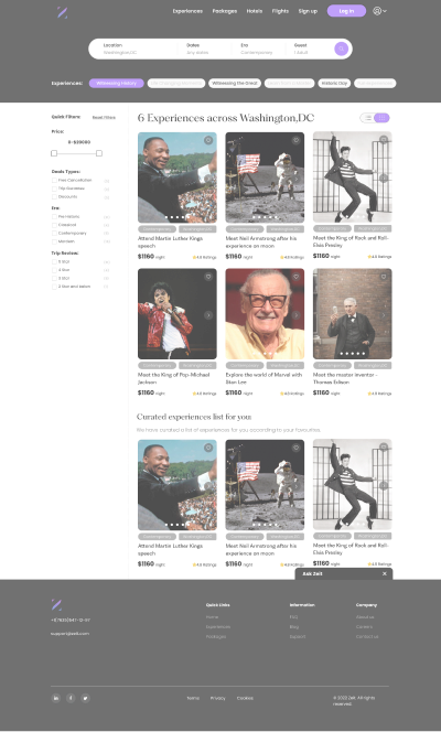
Before Testing

After Testing
Added a List View option as during the interviews I found out that 4 out of 5 participants expected to see a list view or tried to change the view to list.
Added the itinerary of the experience on the experience detail page so that the user knows what all is included in the package before paying for it.
Experience Details Page


Before Testing
Other Pages

Learnings and Next Steps
Working for a brief time travel was exciting and I could foresee a lot of UI elements I wanted to do with the project. But interestingly enough the research process was much more fun than the interface design. Learning and observing participants’ reactions to a time travel website was insightful and made me realise as a UX designer that the user’s need for a product is that it is easily understandable, useful and usable. Then it doesn’t matter if you are designing an e-commerce fashion website or a time travel experience booking website.
Next Steps -
To continue iterating the product by conducting more usability tests amongst different use cases.
To add more pages and interactions to the HI-Fi prototype.
Define UX metrics to determine the success or failures of the website to further learn from it.