

Mission Weight Loss
WEBSITE REDESIGN
Project Duration
4 Weeks
My Role
Product Designer, UX/UI Designer User Researcher
Tools
Figma, Optimal Sort, Adobe Illustrator
Overview
MWL is an existing weight loss service from a nutritionist. The goal of the project was to analyse the user experience of the current website and provide solutions which increase the conversions of the website and can make the experience easier for users to follow.
Design Process
As this was a client-based project, I started out by writing a design brief with the stakeholders involved where I mentioned the business goals, major design deliverables and metrics that will track the outcomes.
I started out by performing a Heuristic audit of the existing website and then through competitive research to understand the market in depth followed by User interviews, re-looked at information architecture, Hi-fi prototypes and then testing, concluding with priority iterations and hand-off notes for developers.

Let’s Talk about the Problem
Mission Weight loss as a business wants to increase its conversions and overall sales. The current website is not professional looking and it is not able to show the users the different services it offers to the users. In order to make the process of booking a call and convert users into buying a health program, the effort is to make the experience smoother and more professional.
Problem Statement
While enrolling for a fitness program, users often face issues like a lack of detail and spend a lot of time understanding if the programme will be customised according to their body needs.
This is a problem as fitness is an intimate issue for a user, and a lack of detail to make the user feel assured can result in fewer conversions, affecting the business directly.
Proposed Solution
To redesign the website focusing on highlighting important information, working on navigation and giving users an easy-to-follow experience for booking an appointment.
To work on the UI and branding to make the website look modern and professional so that the user is able to trust the company.
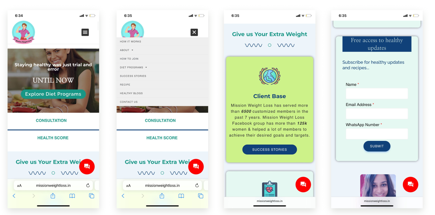
Sneak Peek at the proposed solutions


Before
1.UI UPLIFT & CONTENT REVAMP
Improved the UI and brought consistent branding to the whole website.
After


Before
After
REVAMPED HEALTH PROGRAM PAGE


ADDED A LANDING PAGE FOR ‘HOW TO JOIN’
COMPETITIVE ANALYSIS
DIRECT COMPETITORS USED A MOTIVATING YET HELPFUL TONE AND ALSO USED A LOT OF TESTIMONIALS FOR USERS TO BE ABLE TO TRUST THE BRAND.
Key Takeaways :
Clear, Simple UI.
Less but apt content
Highlighted CTA
Motivated, helpful tone
Testimonials are king
Free consultations
Things to avoid :
Information overload
No detailed information of programs
Confusing Navigation
Lack of Human Touch
Using Jargons
HEURISTIC EVALUATION
A heuristic evaluation was conducted to find out the inconsistencies and other fallouts in the usability of the website.

USER RESEARCH
Research Goal :
We want to learn how the users currently navigate through the MWL website and figure out the process to register for the plans. We also want to understand users' motivations and concerns while selecting a plan. This will help in tailoring an easier experience to encourage more conversions.
USERS WANT THE ABILITY TO BOOK APPOINTMENTS EASILY. THEY WANT TO FEEL SAFE & SUPPORTED WHILE ENROLLING AND HAVE REGULAR CHECK-INS FROM A WELL-READ COACH
INTERVIEWED A MIX OF 5 USERS - WHO WERE FOLLOWING A FITNESS ROUTINE, ENROLLED ON A PROGRAM OR ARE NEW TO THE FITNESS. Questions were asked to understand the overall experience of users already enrolled with a competitive brand, and identify the pain points and barriers in selecting a plan for themselves. The data were synthesised through thematic analysis and then grouped by needs, pain points want and motivations.
TAKEAWAY FROM THE RESEARCH
“I am desperate for help but I need a constant mentor who is well-read and can understand my body and then provide a plan” - Anita Singh
PROBLEM STATEMENT
After learning about the user's pain points, motivations and overall experience expectation, I consolidated problem statement which help guide the rest of the design process
While enrolling for a fitness program, users often face issues with a lack of details and spend a lot of time understanding if the programme will be customised according to their body needs.
This is a problem as fitness is an intimate issue for a user, and a lack of details to make the user feel assured can result in fewer conversions, affecting the business directly.
USER PERSONA
Meet Pallavi Kumar, a working mother who is interested in enrolling in a health program that will help her change her lifestyle to be more healthy.

To further empathise with the user and deeply understand what are the experiences the user is going through I used empathy Mapping where I captured what the user is doing, thinking, listening and seeing.

INFORMATION ARCHITECTURE
Using CARD SORT to reimagine the information architecture of the site.
One of the key areas of improvement which could help in improving the user experience found in user research and competitive analysis was how the content (information) is made on the website. In the current MWL experience, the information was not distributed well and that was hindering a smooth experience.
I conducted a hybrid card sort to determine the categories and had about 20 cards. I asked a group of 7 participants to sort them according to their preferences.

Used optimal sort to help conduct the Card sort.
The categories given to the users were:
How to join
About Us
Health Plans
Success Stories
Contact Us

In the card sort, two new categories were coined by the user - MWL community and videos, and both these categories were discussed with the stakeholders. As a business goal, it was decided that this content should be directed at social media and we can let go of it on the website.
This will also help in prioritising only important information on the website.
CART SORT OBSERVATIONS
SITE MAP
After a content audit and card sort exercise, I went ahead to plan out a revamped site Map for MWL

HAPPY FLOW
After mapping out the site map I went ahead to structure the happy flow for the key user persona.

Brainstorming Design Solutions
I started the design process by brainstorming design solutions with the help of sketches and browsing through different UI patterns. Some of the examples are below -


STYLE KIT
As I also wanted to work on improving the branding so that the user can trust the brand and there is UI consistency I worked on it with the help of the stakeholder to decide on a font which is more modern and clean and a logo which is minimal and captures the essence of the brand.

FINAL SCREENS & MAJOR IMPROVEMENTS
The hi-fi was made for the homepage, Health plans & How to join landing page for both desktop and m-site. A questionnaire of a mix of basic information that the coaches generally need before suggesting a programme was also added.
After the Hi-fi prototype, I wanted to test the flow with the users first-hand. A test plan for the same was made with a number of tasks which the users were instructed to perform on a video call while sharing the screen.
Some of the Sample questions can be seen here


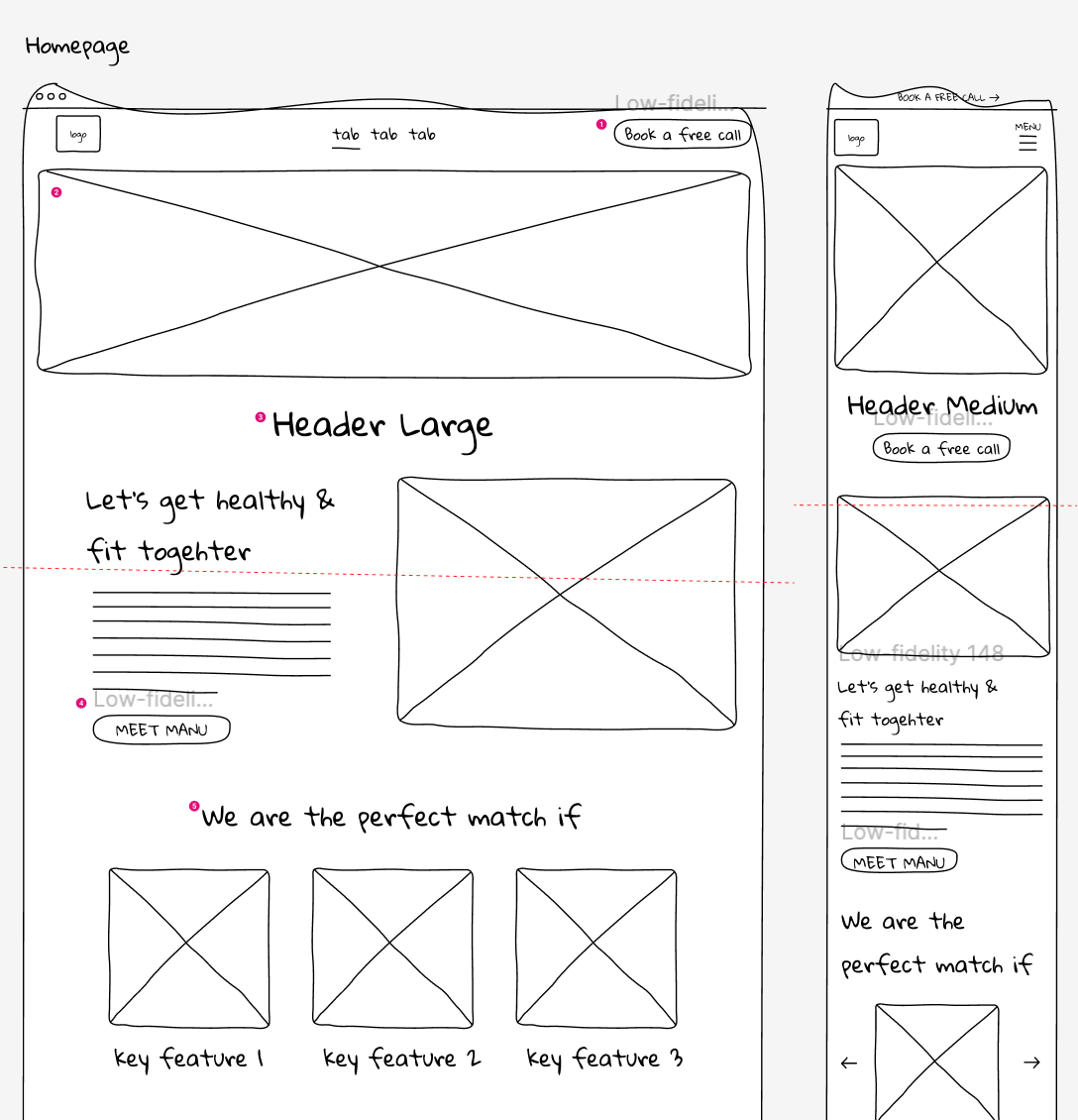
THE HOMEPAGE
Added a hero banner to give out concise information about MWL with a CTA - to book a free call.
After testing it was found that the user wanted to see the different benefits of MWL, hence a strip with benefits was added just below the hero banner
Highlighted Testimonials
Added a secondary button to the UI KIT to differentiate between primary actions.


THE HEALTH PLAN PAGE
Added a hero banner with an actionable CTA and also an offer tag
Reduced content further
Moved whats inside the package in the first fold page itself so that it is easier to find.

BOOK A CALL QUESTIONNAIRE
Added a line just above the CTA- this will only take a min so that users don’t close the screen thinking that this might take a long time
Added question numbers
Added skip this question button so that if the user is not comfortable sharing intimate details they should still be able to fill the form.
Actionable Steps
Continue iterating based on the data collected from usability tests
Design other pages like about us, contact us etc
Ideate on coming up with a live chatbot
Help with dev handover
Learnings
Meeting with stakeholders and aligning the business goals with the designs.
Conducting heuristic evaluation and other important methods and making the stakeholder understand that these processes are important.
Be very consistent with keeping meetings with stakeholders and sharing your progress with them for feedback.