
F3- Furniture for future
F3 is a new interior design app where users can select any type of furniture and see it in Augmented Reality
Project Duration:
4 weeks
My Role :
UI/UX Designer, Interaction Design, User Research
Tools Used :
Figma, AR app, Abobe Photoshop
Overview
Have you ever been in a store and agonized over which piece of furniture should you take home? Which colour would match better, maybe?
F3 solves this problem and takes their solution to the next level.
A lot of businesses are trying to embed the technologies somehow, but the user experience is not quite there. For most consumers, AR and VR are flashy and attractive, but not really useful.
As with every new technology, we need to find the right usage for it and bring it to customers by solving a problem that they encounter or by providing additional value to their current goals. F3 aims to do just that.

Design Process

Started out by doing research on AR and competitive analysis to understand the technology and how it interacts with the user. Conducted user interviews and testing to understand AR tech in apps. Followed by Design, prototyping and user testing the design to collect feedback and iterate accordingly.
Let’s Talk about the Problem
QUICK LOOK - PROBLEM & PROPOSED SOLUTIONS
Users are unable to understand the size and colour of the furniture while viewing the furniture online.
Users are not sure if the furniture will fit in the theme of their space.
Problem Statement
Users are unable to make a confident decision while choosing a piece of furniture for their place. This is a problem because the target audiences are likely to abandon the cart when they are unable to UNDERSTAND THE LOOK, FEEL AND DIMENSIONS OF THE FURNITURE.
Hypothesis Statement
An improved online experience will help in increasing the conversion rates of the cart which help the business in overall revenue. Users what the ease of choosing furniture that will fit their requirements both size and aesthetic wise so that they spend their money and time wisely.

A small snap from the proposed solution prototype - From PDP to AR mode
AR Mode with helpful and intuitive nudges with a bottom bar to instantly add items to the bag.

A small snap from the proposed solution prototype - Measuring tool & Magnifying tool
A toolbox with the most essential tools will help the user that a well-informed decision.
This is a quick look at some of the proposed solutions. More proposed solutions and prototypes after the research section.
But is AR worth the hype?
DISCOVERY : SECONDARY RESEARCH
According to a CNBC article date March’22 Tim Cook, the Apple CEO quoted “The future of AR will go much, much further”. Apple is reportedly developing an AR/VR headset. He also said “ We are really going to look back and think about how we once lived without AR”
An article by Harvard Business Review also suggested that every organisation should have an AR strategy as it is the future tech of the world. It also quoted that spending on AR technology will hit $60 billion in 2020. In the coming months and years, it will transform how we learn, make decisions, and interact with the physical world. It will also change how enterprises serve customers, train employees, design and create products, manage their value chains, and, ultimately, how they compete.
As a UX designer, my goal in this project is to understand the user’s expectations of AR technology and make it usable, learnable and efficient.
DISCOVERY - COMPETITIVE ANALYSIS
DIRECT COMPETITORS HAD SOME FUNCTIONAL LIMITATIONS LIKE THE AR SCREEN NOT HAVING ENOUGH INFORMATION, NOT BEING ABLE TO ZOOM IN ETC WHICH CAN MAKE THE USER FEEL RESTRICTED AND UNCOMFORTABLE WITH THE TECHNOLOGY.
Detailed competitive AR EXPERIENCE analysis
DISCOVERY - USER INTERVIEW
INTERVIEWED 5 USERS - who have bought furniture online and offline to understand the current pain points they have while looking for furniture or interior decor items.
Research Goal - We want to learn how people currently choose furniture for their homes, offices or any other personal space and understand what are the motivations and concerns a user has while buying furniture.
We also want to learn how people think and feel about AR and understand the motivations and barriers they might have if they ever used AR.
Users want the ease of choosing furniture that will fit their requirements both size and aesthetic wise so that they spend their money and time wisely.
RESEARCH DEBRIEF -
2 out of 5 users who have used AR while making a purchase decision suggested that it would help if they could understand the height of the product with more clarity.
Major Pains Points-
Most users could not understand the size, colour and feel of the material confidently.
Not able to figure out if the material the furniture is made of is strong and would last long.
Not able to understand how it would look in their space.
A considerable amount of time was spent in the AR mode to understand how to place and rotate the furniture
“What if the chair is not of the perfect size for my height and
for my room” - Sree
Quote from one of the user’s interview transcripts
ANALYSIS - CUSTOMER JOURNEY MAP
In the Analysis phase of the design process, I started by mapping out the user’s journey map to understand how the user is feeling that different stages of the process. I also identified opportunities and insights which will help me in deciding on features for the app.
ANALYSIS - USER PERSONA
MEET, PALAK SHARMA, A WORKING WOMAN WHO HAS RECENTLY MOVED TO A NEW CITY AND WANTS TO SET UP HER NEW SPACE ACCORDING TO A THEME IN HER MIND.
After mapping out the user persona, I went on to analyse how the user is feeling, thinking and saying on the basis of the user interviews. With the help of an empathy map, I could understand more about my user and also understand the pain and gains of my user. Download the map from the button below to view the same.
DESIGN - DESIGN PATTERNS & SKETCHES
I explored some design patterns for how the screens of the AR mode can look like. Some important wants of the users like tools, snapshot, measurements etc were my priority and their placement of it was important to improve the experience for the users. Here are some of the iteration sketches -
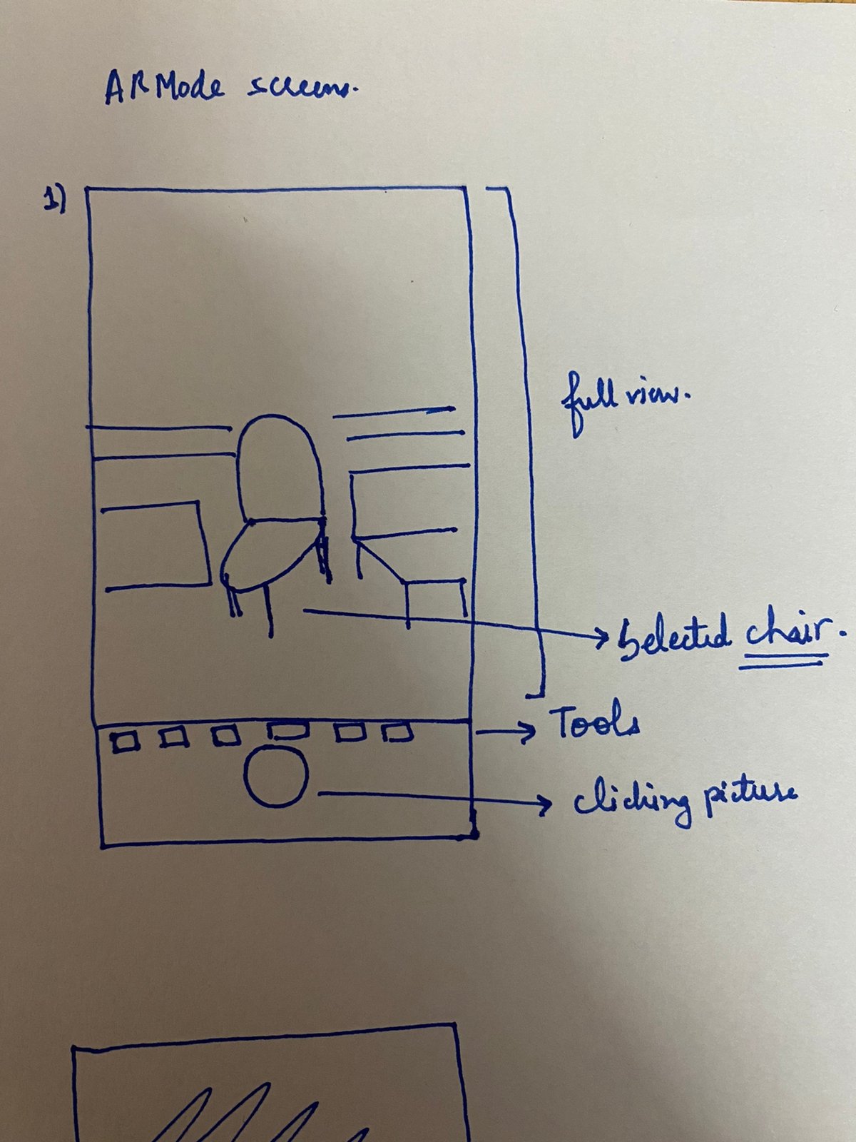
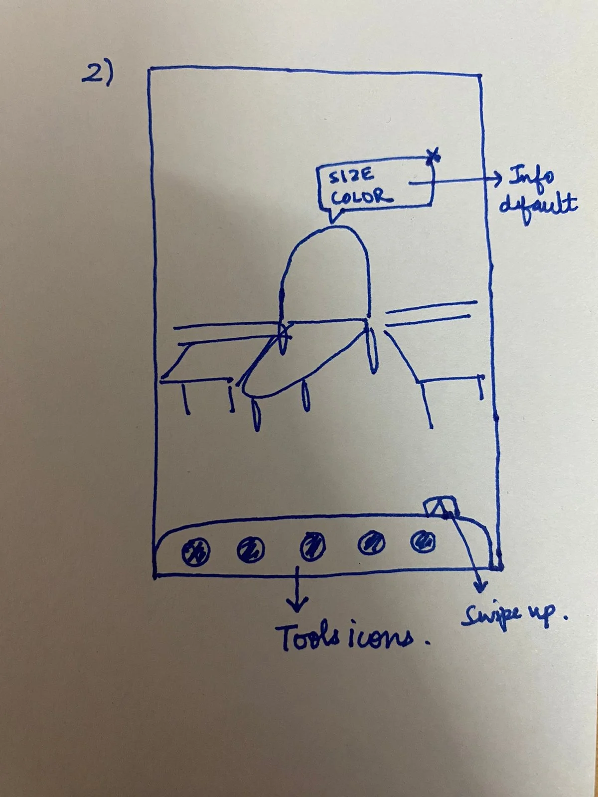

Image 1 - I wanted the screen to look like a normal camera app screen so that it is very easy for the user to understand and they feel familiar and comfortable with the UI.
Image 2 -Tried a different placement for the tool box and a overlay of important information of the object.
Image 3- Explore how View similar features can look like with a bottom sheet with an image of the product and the price.
ANALYSIS - USER FLOW -Mapping out the happy user’s flow
Lo-fi Wireframes


Hi-Fi screens & Improvements
After making the Hi-fi screens, I also conducted a usability test to understand how the user is responding to the screens developed. This really helped me in making the screens more intuitive and also testing if certain elements like icons are the correct choice and users are able to understand the meaning of them. Using the affinity map where I classified the insights received by the users into categories
which will help me understand and empathise better with the user’s needs and how they respond to the experience created.

An onboarding experience was created for the user to make them aware of how this interior app is different from others and what all functionalities are available to them.
Each screen has a get started tertiary button if the user wishes to skip the experience they can directly jump to the log/sign-in screen.
After the usability test, I changed the tertiary CTA language from “Skip” to “Get started” to make it sound more actionable.
I also made the login screen more visible and on the screen so that the user doesn’t have to make too much effort to log in.
1.Onboarding Screens

The user will be able to search for the furniture from the homepage itself and also will be able to filter the choice by price, categories, ratings etc.
After testing I included two tooltips both near the AR icons to introduce the feature to the user and attract the attention of the user to it.
During testing, I could observe that 3 out of 5 users dint not notice the View in your home button on the Product Description Page.
2. Searching a Product

The user sees the View in your Home button, clicking they can enter the AR mode.
Helpful nudges such as “Move your mobile side to side” and illustrations which can help the user understand a particular tool has been added to make the user feel supported and comfortable with the technology.
A toolbox has also been added with tools like - measurements, zoom in and out, view 360 degrees and double tap to see colour ways.
The toolbox is also expandable if the user wishes to see a full view they can close the toolbox and view the full screen.
After testing I also added a close button to delete the item from the screen easily and place an item from the similar screen tool
I also added the Wishlist and add to bag bottom navigation for users to be able to add the product directly to the bag.
3. View it in your Home - AR Mode

Other important functionalities such as taking a screenshot and viewing similar items were added to help the user have a more valuable experience.
For similar items the products are visible in small circles below the user can choose and slide the one which they would like to see on the screen.
An overlay with important information like price, colorway and dimensions are also added for the selected product
4. Other important functionalities
Actionable Steps
Iterate more with in-person and mobile testing.
Try and find more solutions for cross-selling as it was something which I feel could have been done better
Keep trying out new AR/VR apps and learn more about the new tech and how UX can make it easier and learnable.
Learnings
Learnt about AR in depth and how it will be an impactful tech in the future.
I also learnt how to create end- to end experiences for a product.
There were a lot of experiments I did for interaction design and it made me feel more confident about my software skills.